Responsive Design: Ensuring a Consistent User Experience Across Devices
In the dynamic landscape of digital interaction, where users seamlessly transition between devices, responsive design has emerged as a fundamental solution to deliver a consistent and optimized user experience. Whether accessing websites on a desktop, tablet, or smartphone, users expect a seamless and visually appealing interface. Responsive design, a web development approach that prioritizes adaptability, addresses this expectation by ensuring that websites respond intuitively to the device's screen size and orientation. In this comprehensive guide, we explore the principles, benefits, and implementation of responsive design, highlighting its significance in creating a harmonious user experience across diverse devices.
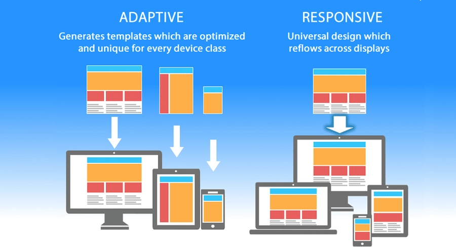
UNDERSTANDING RESPONSIVE DESIGN: THE FOUNDATION OF ADAPTABILITY
Responsive design is a web development philosophy that prioritizes creating websites capable of adapting to various devices and screen sizes. Unlike traditional fixed layouts that may not scale well on smaller screens, responsive design employs flexible grids, media queries, and fluid images to dynamically adjust content presentation based on the user's device.
KEY COMPONENTS OF RESPONSIVE DESIGN
1. FLEXIBLE GRIDS
Responsive layouts are built on flexible grids, utilizing relative units like percentages instead of fixed units like pixels. This allows elements to adjust proportionally based on the user's screen size, ensuring a harmonious visual experience.
2. MEDIA QUERIES
Media queries enable developers to apply different styles or rules based on the characteristics of the user's device. These queries check factors like screen width, resolution, and orientation, allowing the website to tailor its appearance accordingly.
3. FLUID IMAGES
Images in responsive design are fluid, meaning they scale with the size of the container. This prevents images from being cut off or extending beyond the boundaries of the screen, contributing to a visually pleasing and well-balanced design.
BENEFITS OF RESPONSIVE DESIGN: CREATING A SEAMLESS USER EXPERIENCE
1. CONSISTENCY ACROSS DEVICES
The primary advantage of responsive design is the ability to provide a consistent user experience across devices. Whether a user accesses a website on a desktop, tablet, or smartphone, the content, layout, and functionality remain cohesive, fostering familiarity and ease of use.
2. IMPROVED SEO PERFORMANCE
Search engines prioritize mobile-friendly websites in their rankings. Responsive design, by offering a unified URL and HTML code for all devices, enhances SEO performance. This consolidated approach avoids duplicate content issues associated with separate mobile sites.
3. COST-EFFICIENCY
Developing a responsive website eliminates the need for maintaining separate versions for various devices. This cost-effective approach streamlines development, updates, and maintenance processes, reducing overall expenses for businesses.
4. ENHANCED USER ENGAGEMENT
A responsive design contributes to improved user engagement by eliminating barriers to access. Users are more likely to stay on a site that seamlessly adapts to their chosen device, leading to increased interaction, longer visit durations, and a positive overall user experience.
5. ADAPTABILITY TO NEW DEVICES
With the continuous evolution of devices, from wearables to larger screens, responsive design ensures adaptability. As new devices enter the market, a well-implemented responsive website remains equipped to provide an optimal user experience.
IMPLEMENTATION OF RESPONSIVE DESIGN: BEST PRACTICES
1. MOBILE-FIRST APPROACH
Start designing for mobile devices first and then progressively enhance the design for larger screens. This ensures a solid foundation for the most constrained environments and a streamlined scaling process.
2. FLEXIBLE IMAGES AND MEDIA
Optimize images and media to be flexible and scalable. Implement the use of CSS media queries to adjust image sizes based on the device's screen width, ensuring efficient loading times without compromising quality.
3. BREAKPOINTS FOR LAYOUT ADJUSTMENTS
Define breakpoints in your CSS where the layout of the website needs to adjust for different screen sizes. Common breakpoints include those for smartphones, tablets, and desktops, ensuring a smooth transition between layouts.
4. TESTING ACROSS DEVICES
Regularly test your responsive design across various devices and browsers to identify and address any inconsistencies. Emulators and responsive design testing tools can assist in simulating different device environments during the development process.
4. PERFORMANCE OPTIMIZATION
Optimize website performance by minimizing unnecessary elements for mobile users and employing techniques like lazy loading for images. Fast load times contribute significantly to a positive user experience.
CHALLENGES AND CONSIDERATIONS IN RESPONSIVE DESIGN
While responsive design offers numerous advantages, it is essential to be aware of potential challenges and considerations:
1. COMPLEXITY IN DESIGN AND DEVELOPMENT
Implementing responsive design can be more intricate than traditional fixed layouts, requiring careful planning and execution. Designers and developers need to collaborate closely to ensure a seamless and visually appealing experience across devices.
2. PERFORMANCE CONCERNS
Ensuring quick loading times across various platforms can present difficulties. When putting responsive design into practice, developers need to maximize assets, make use of effective coding techniques, and take performance concerns into account.
3. BROWSER COMPATIBILITY
Variations in browser rendering can impact the consistency of a responsive design. Regular testing across multiple browsers is crucial to identify and address any compatibility issues.
4. BALANCING FLEXIBILITY AND CONTROL
Striking the right balance between flexibility and maintaining control over the design elements is essential. While flexibility is critical for responsiveness, designers need to ensure that the core branding and user experience principles remain intact.
CONCLUSION: CRAFTING DIGITAL EXPERIENCES FOR THE MODERN WORLD
In a world where users seamlessly transition between devices, responsive design stands as a testament to adaptability and user-centricity. As technology continues to evolve, the importance of delivering a consistent and optimized user experience across diverse devices becomes increasingly evident. Embracing responsive design is not merely a technical necessity; it is a strategic choice to meet user expectations, improve SEO performance, and enhance overall digital interactions. By following best practices, addressing challenges proactively, and staying attuned to emerging trends, businesses can ensure that their online presence remains resilient and user-friendly in the face of ever-changing technological landscapes. Responsive design is not just about adapting to different screens; it's about creating digital experiences that seamlessly accompany users wherever they go in the digital realm.

Some quick example text to build on the card title and make up the bulk of the card's content.
12 June 2023

Some quick example text to build on the card title and make up the bulk of the card's content.
12 June 2023
.jpeg)
Some quick example text to build on the card title and make up the bulk of the card's content.
12 June 2023
Some quick example text to build on the card title and make up the bulk of the card's content.
12 June 2023
Some quick example text to build on the card title and make up the bulk of the card's content.
12 June 2023
Some quick example text to build on the card title and make up the bulk of the card's content.
12 June 2023